


It did not start with a blank Figma file. It started with a problem I kept seeing, billing systems that felt like punishment, invoice flows that took longer than they should, interfaces that made a simple task feel complicated. Somewhere in looking at that problem, a product took shape in my head: ZapBill, a billing tool for Salesforce users that would feel like the opposite of every frustrating billing experience I had encountered. Once the product vision was clear, the next challenge was making the website feel like the product itself. Not a description of ZapBill. An experience of it, fast, clean, and obvious within the first few seconds of landing on the page. That is the brief I gave myself, and this is how it went.
Step 1: Mapping Before Designing
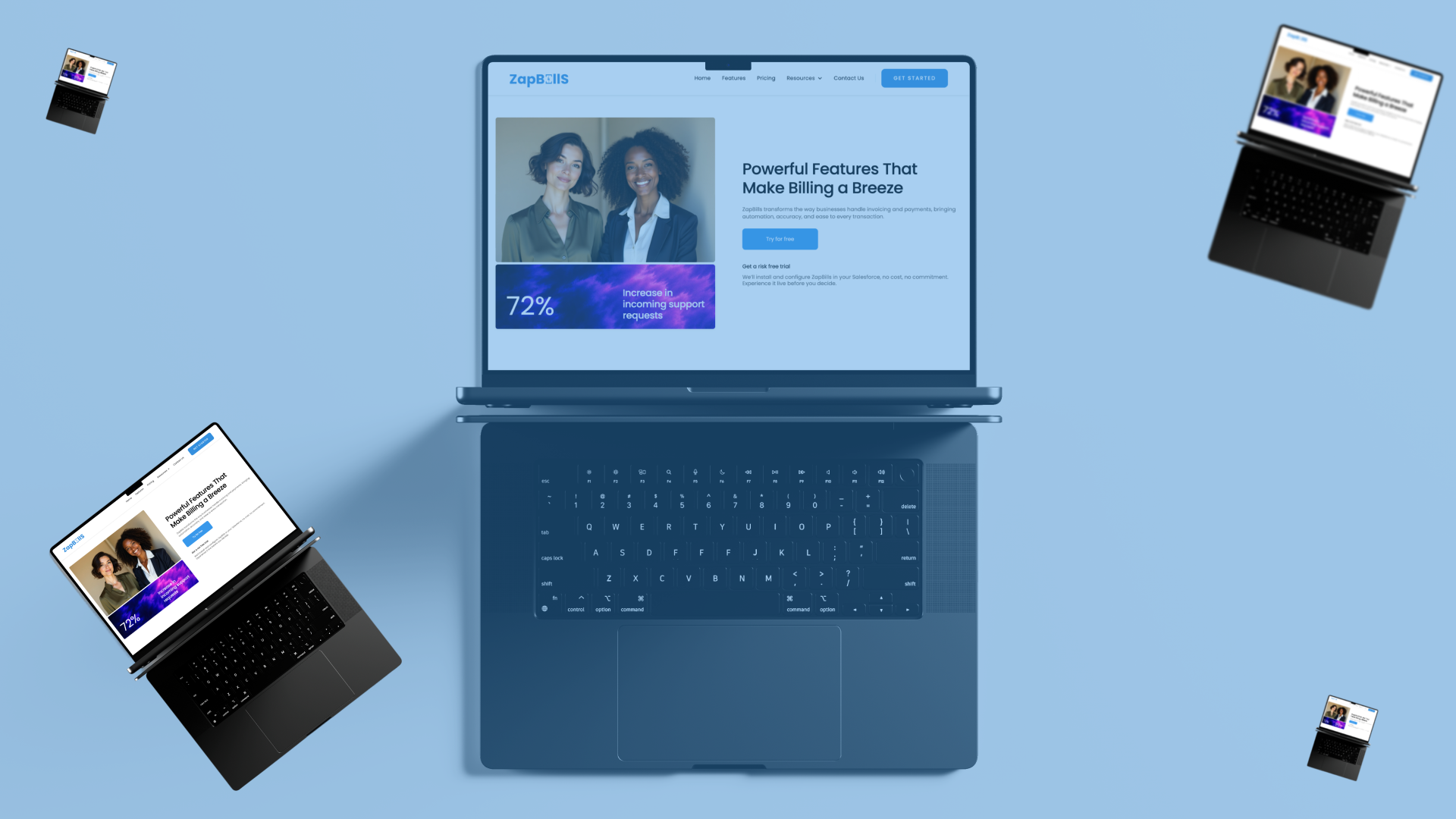
Before opening a new frame in Figma, I spent time on a question that mattered more than any visual decision: what does this site actually need to do? A product website for something like ZapBill has one job, help someone understand what it is, why it matters, and what to do next, without making them work for any of it. Every page needed to earn its place against that standard. The page map I landed on was five pages, each with a specific and non-overlapping purpose. The Home page had to create a strong first impression and tell the story immediately, no long lead-ups, no clever misdirection. The Features page had to show precisely what ZapBill does, in a way that was visual rather than text-heavy. The Pricing page had to be completely clear, with no hidden details or confusing tier logic. The How It Works page had to walk through the product in simple, sequential steps that anyone could follow. The Support page had to signal that real help was available for real questions. Every page started with a clear job. That clarity made every subsequent design decision easier.
Step 2: Designing in Figma
I skipped the mood board phase. When a product vision is already clear, mood boarding can become a way of deferring the actual design decisions indefinitely. Instead, I moved directly into layouts. The color choices were intentional from the start. Primary blue at #3490DE, a tone that reads as trustworthy, modern, and clean without being cold. Light grays and generous white space around it, so the blue could breathe and direct attention without overwhelming the page. The combination gives the site the premium, uncluttered feel that ZapBill the product aims to deliver. Typography stayed clean and readable throughout. Sans-serif headings for clarity and speed. Body text sized and spaced for genuine readability rather than squeezed to fit more content per screen. Spacing was deliberately generous big, open sections that give the eye room to rest and the content room to land. Every call-to-action button followed the same treatment: rounded corners, a subtle shadow, and hover states designed to feel responsive and satisfying rather than mechanical. Buttons that feel good to click encourage the behavior the page is designed to produce. Icons and graphics stayed minimal, modern, and consistent across every page. When visual language varies across a site, the user's brain has to recalibrate. When it stays consistent, navigation becomes effortless. The design rule I applied to every section was simple: if someone cannot understand this in five seconds, the section needs to be reworked. Not refined reworked. Complexity that survives five seconds of scrutiny usually means the communication problem has not been solved yet.
Step 3: Building in Webflow
Moving from Figma into Webflow is where the design either holds up or reveals its weaknesses. A layout that looks convincing in a static frame has to work as a real, interactive, responsive system and that transition exposes assumptions that flat design never tests. The first thing I built was the global style foundation: color swatches, typography scales, and spacing rules defined once and applied consistently throughout. Building this foundation first means every subsequent element inherits the same system rather than diverging gradually into inconsistency. It also makes changes faster adjusting a global style updates every instance at once. With the foundation set, I built the structural components: navbar, hero sections, feature grids, pricing tables, footers. The structure before the decoration getting the layout right before adding interaction details. Interactions came next, and I kept them purposeful rather than decorative. Smooth fade-ins on scroll give the page a sense of progressive reveal that matches the way people actually read sequentially, not all at once. Buttons that react instantly to hover and click give tactile feedback that makes the interface feel alive. Subtle image hover effects add depth without demanding attention. Every interaction had to serve the experience rather than demonstrate that interactions were possible. Responsive design was treated as a requirement from the beginning rather than a cleanup task at the end. Every layout was tested at mobile and tablet breakpoints throughout the build, not only at the finish. Catching responsive issues early is significantly less painful than rebuilding sections that work on desktop but break everywhere else.
Step 4: Final Refinements
The gap between a good build and a polished one often comes down to the small adjustments that are easy to skip when a deadline is close. Padding and margins were reviewed systematically not just visually checked, but tested against the grid to ensure nothing felt cramped or inconsistently spaced. Images were optimized for fast loading, because a site that communicates speed as a product value cannot afford to load slowly itself. Accessibility was checked contrast ratios, font sizes, and interaction states because a site that only works for some users is not doing its full job.
What ZapBill's Site Does Now
The website that came out of this process loads fast, explains the product clearly within the first scroll, feels smooth to navigate, and works correctly across every device and screen size. There is no filler content, no decorative complexity, and no moment where the user has to work to understand what they are looking at. It feels like using ZapBill. That was the brief. That is what it does. The part of this process I found most valuable was not the tools — Figma and Webflow are both excellent, and neither of them is the hard part. The hard part is the clarity that has to exist before you open either one. When the problem is understood, when the product's purpose is clear, and when every page has a specific job it must do, the design decisions that follow become considerably more obvious. Start there. The blank canvas is much less intimidating once you know what it needs to becomes..


.png)