


Most people think typography is about picking a font that looks good. It is not. Typography is invisible technology quietly controlling how fast users understand information, how much they trust what they read, and whether they take action or leave. When it works, nobody notices. When it fails, nobody knows why they left.
Typography Is Now a Performance Metric
AI systems, search algorithms, and recommendation engines do not evaluate whether your font is beautiful. They measure whether people read longer, scroll further, and engage more. Fonts that improve readability get rewarded with more reach. Fonts that create friction get buried. In a world where machine learning systems continuously evaluate user behavior at scale, typography has moved from aesthetic preference to performance infrastructure. It is no longer a design decision, it is a product decision.
The Technical Decisions Inside Every Letter
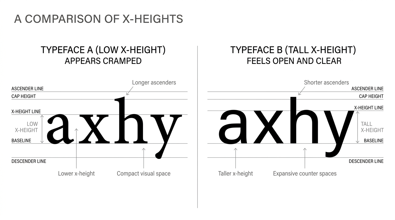
X-height, the height of lowercase letters relative to capitals is one of the most consequential technical choices in type design. Fonts with a taller x-height feel clearer and more legible at small sizes, which is why they dominate mobile interfaces where most content is actually consumed. Equally important are apertures and counters the open spaces inside and around letterforms. When these close up at small sizes, text becomes harder to process. Users will not consciously identify the problem. They will simply feel discomfort and move on. In healthcare interfaces, enterprise dashboards, and consumer apps, this invisible friction translates directly into worse outcomes and higher abandonment.
Fonts Communicate Before Words Do
The brain processes typeface in milliseconds long before it reads a single word. This means your font is already shaping perception before your content gets a chance. Serif fonts carry associations of credibility, education, and tradition which is why they remain dominant in publishing, finance, and legal contexts. Sans-serif fonts feel modern, efficient, and direct which is why they define the visual language of apps, SaaS products, and digital interfaces. Display fonts create energy and urgency powerful for headlines, dangerous when overused. Choosing a font without understanding these associations is like choosing a tone of voice without considering what it communicates.
Hierarchy Tells Users Where to Look
Users do not read screens they scan them. Their eyes move in patterns, hunting for the most relevant information as quickly as possible. Typography hierarchy is the system that guides that scan: telling the eye where to start, what to prioritize, and what can be skipped. Strong hierarchy does not require multiple font families. It requires clear size contrast, deliberate weight variation, consistent spacing, and disciplined alignment. When these work together, users navigate an interface without thinking. When they do not, users feel confused without knowing why and confusion at the interface level almost always results in inaction.
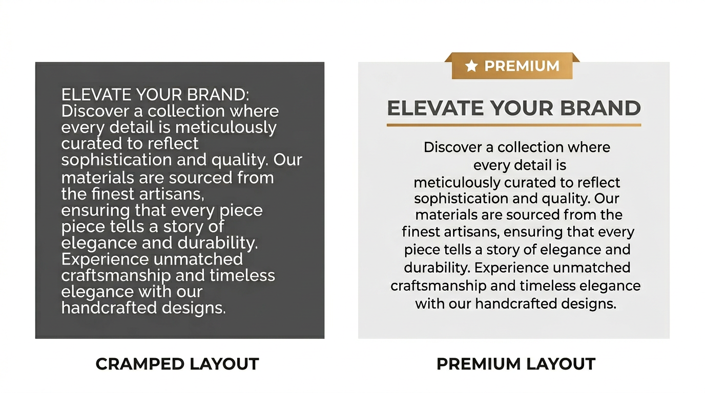
Spacing Is Where Typography Becomes Invisible
Line height, letter spacing, paragraph margins these are the decisions that determine whether reading feels effortless or exhausting. Generous spacing reduces eye fatigue, makes content feel considered and premium, and helps users process complex information without cognitive overload. Tight spacing does the opposite, even when the font itself is excellent. The irony of spacing is that its impact is most felt when it is wrong. Done correctly, it disappears entirely and the user simply experiences clarity without being able to say where it came from.
Build a System, Not a Series of Choices
The single most scalable improvement any design team can make is moving from individual font choices to a defined typography system one that specifies sizes, weights, line heights, spacing rules, and color relationships across every context the product appears in. A system eliminates guesswork, creates consistency across platforms, speeds up design decisions, and ensures the user experience remains coherent as the product grows. Products without typography systems accumulate visual inconsistency over time until the interface feels like it was built by many different people with no shared standard because effectively, it was.
Design for the Screen Users Actually Have
Typography decisions made on a high-end display in a controlled environment will encounter cracked screens, bright sunlight, aging hardware, and tired eyes in the real world. The gap between ideal conditions and real conditions is where most typography decisions quietly fail. Testing across devices, screen qualities, and operating systems is not optional for products serving large or diverse audiences, it is the minimum standard for taking usability seriously.
Typography is Strategy
Every business outcome that depends on a user reading, trusting, and acting conversion rates, retention, pricing perception, credibility is partially a typography outcome. The same product description set in the wrong typeface can feel cheap, untrustworthy, or confusing. Set correctly, it feels premium, clear, and worth paying for. Typography does not make things look better. It makes things work better for the humans reading them and the systems evaluating them. Once you see it that way, every font choice becomes a strategic decision rather than a stylistic one.


.png)